


In the Pacific Coast environment, a brand faces unique challenges. Between the 4:00 PM winter sunsets and the persistent grey of “Junuary,” our local lighting conditions can swallow a visual identity whole.
If a design isn’t intentionally built for high-contrast and physical durability, it simply won’t last.
Building a visual identity in the Metro Van area requires a different rulebook. The environment here is beautiful, but it is also a relentless visual competitor. When you are designing a graphics package for a brand based in Vancouver, Burnaby, or the surrounding municipalities, you are up against heavy mist, salt air, dramatic UV shifts, and the infamous early darkness of winter.
True sustainability in graphic design goes beyond choosing eco-friendly inks.
Sustainable design means creating a visual identity that endures. It means building a graphics package that does not fade, peel, or become illegible the moment the seasons change.
At Can-Design, we approach the design consultation process as a funnel, taking your high-level aesthetic vision and stress-testing it against the realities of the West Coast climate.
Chapter 1: The Environmental Audit and The “Grey-Day” Filter
The consultation phase always begins with an honest assessment of light.
A brand color that looks stunning on a brightly lit computer monitor in a studio can completely disappear when printed on a storefront sign in November.
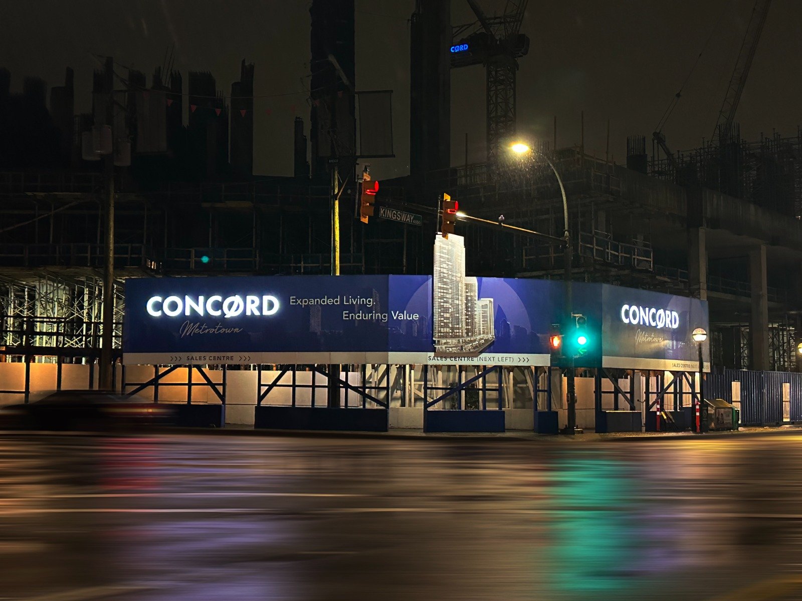
Vancouver experiences months of flat, diffused lighting caused by heavy cloud cover.
Understanding Light Reflectance Value. In the architectural and signage world, we look closely at the Light Reflectance Value, or LRV, of your chosen brand colors.
This measures how much light a color reflects versus how much it absorbs. During a consultation, we analyze your primary palette to ensure it has the appropriate LRV to stand out against slate-grey skies and dark, wet pavement.
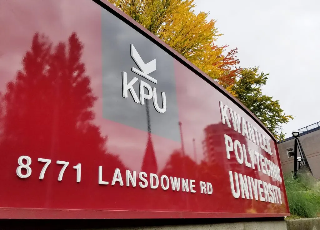
Avoiding the Visual Washout. A common mistake is selecting mid-tone blues, greens, or greys as primary brand anchors without a high-contrast secondary color. In the rain, these mid-tones lose their edge.
We work with you to develop a color strategy that incorporates high-chroma accents or deep, grounding neutrals. This guarantees your business remains visible at night and cuts through the seasonal haze.
Designing for the Golden Hour. While we spend a lot of time talking about the rain, Vancouver summers deliver intense, direct sunlight. A sustainable graphics package must adapt to both extremes. We help you build a modular color palette. This allows you to use your deeper, high-contrast colors for winter applications and your softer, glare-resistant tones for bright summer promotions.
A Can-Design Experience: We tend to always recommend allocating a fair and reasonable amount of resources to this step. I
t’s expensive to get this done right for a reason.
Reason being is that you will live with these design choices for years to come. Rushing and going the cheaper route tends to backfire on a lot of businesses. We combat this by giving you a realistic understanding of each step and why we do those things.
Chapter 2: Typographic Integrity and Legibility in Low Light
Once the color palette is weather-proofed, we funnel our focus into typography. Choosing a font is often an emotional decision for a brand, but in the signage and graphics industry, it must be a technical one as well.
The Danger of Thin Strokes.
Delicate, ultra-thin serif fonts convey luxury and elegance on a business card.
However, when applied to a building fascia or a window graphic, those fine lines often fail.
Rain streaks on glass, fog, and the physical distance of the viewer can cause thin typography to visually bleed or vanish entirely.
Prioritizing Weight and Kerning.
During the graphics package build, we establish specific rules for your typography.
We select primary and secondary fonts that carry enough visual weight to remain legible from a distance.
We also adjust the kerning, which is the space between the letters.
Tightly packed letters tend to blur together when viewed through a rainstorm or when illuminated from behind at night.
Expanding that space slightly ensures crisp readability in all conditions.
Creating the Digital-to-Physical Bridge.
Your graphics package will include specific typographic lockups for different mediums.
The font weight we use for your Instagram graphics might be slightly refined, while the version we export for your outdoor dibond signage will be heavily optimized for environmental visibility.
Chapter 3: Material-First Graphic Choices
A design is only as sustainable as the substrate it lives on. Funneling your choices into a practical graphics package requires a deep understanding of material science. The Vancouver climate subjects outdoor graphics to thermal expansion in the summer and constant moisture in the winter.
Selecting Harsh-Weather Substrates. A massive part of our consultation involves matching your aesthetic goals with the right physical materials. If your brand relies on crisp, vibrant vector graphics, we look at high-performance cast vinyls that resist shrinking and cracking. If you require large structural signage, we explore aluminum composite panels that will not rust in the damp coastal air.
We have detailed our approach to harsh-weather materials here to help you understand the options.
The Impact of Finishes. The finish applied to your graphics drastically alters how the design is perceived. A high-gloss finish might look premium, but in an area with heavy streetlamp glare or wet surfaces, it can become unreadable. We often recommend matte or satin laminates for Vancouver brands. These finishes diffuse harsh light, reduce glare, and provide an extra layer of UV protection to ensure your brand colors remain true for years.
Chapter 4: Navigating the Red Tape of Signage
Building a brilliant, weather-proof graphics package is useless if the city forces you to take it down. A crucial step in our consultation funnel is aligning your design choices with municipal regulations.
Baking Compliance into the Design. Vancouver, Burnaby, and Richmond all have distinct, heavily enforced signage bylaws. These rules dictate how large your graphics can be, how much of a window they can cover, and how they can be illuminated. Instead of designing a logo and hoping it passes the permit phase, we integrate Vancouver’s specific signage bylaws directly into the creative process.
Illumination Strategies. Because the sun sets so early in the winter, illumination is a mandatory consideration. However, cities heavily regulate light pollution. We design your graphics package to accommodate halo-lighting, push-through acrylics, or specific backlit applications that maximize your visibility while remaining completely compliant with local zoning laws.
Chapter 5: The Psychology of Wayfinding in the Dark
Designing a graphics package isn’t just about making your logo look good. It is about how people interact with your physical space. In the Lower Mainland, navigating the streets from November to March is a masterclass in dealing with visual noise. Rain hits the windshield, headlights reflect off wet pavement, and fog rolls in from the coast. Your branding needs to cut through that cognitive overload.
Reducing Cognitive Friction. When a customer is trying to find your Burnaby warehouse or Vancouver storefront in a downpour, they are not reading fine print. They are looking for recognizable shapes and clear directional cues. We design your wayfinding signage using universally understood iconography and high-contrast arrows. This reduces the mental effort required for your clients to locate your entrance, parking, or loading docks.
The Power of Reflective and Luminous Materials. A true weather-proof graphics package considers how the design performs when hit by artificial light. We often incorporate engineering-grade reflective vinyls into directional signage. Even if your main storefront sign is not electrically illuminated, using reflective accents ensures that passing headlights will instantly light up your brand’s core navigational elements.
Scaling for Speed and Distance. Pedestrian traffic in Gastown requires a different design scale than vehicle traffic moving at 60 km/h down Lougheed Highway. During our consultation funnel, we evaluate the primary viewing distance of your audience. We then scale the typography and graphics in your package accordingly. A weather-proof design uses aggressive scaling to guarantee that your brand name is legible through a rain-streaked window from a block away.
Chapter 6: Building the Final All-Weather Toolkit
This is where the theoretical consultation funnels into a tangible product. The final deliverable from Can-Design is not a simple folder with a few image files. It is a comprehensive, climate-resilient graphics package built to be deployed across any physical or digital medium in the Pacific Northwest.
The Master Vector Suite. We provide your visual identity in infinitely scalable vector formats. Because weather-treated substrates like corrugated plastic, aluminum, and cast vinyl require precise cutting paths, your graphics package includes the exact file types needed by production teams. This ensures your edges remain razor-sharp, whether printed on a small decal or a massive architectural hoarding.
Environmental Color Codes. Translating a screen color to a physical sign is notoriously difficult. A standard CMYK mix that looks great on printer paper can turn muddy when printed on heavy-duty outdoor vinyl.
We provide highly specific Pantone matching codes and material-tested color formulas. This guarantees your brand colors remain vibrant and accurate, regardless of the weather-proofing laminate applied over top.
Dark Mode and Low-Light Lockups. Every comprehensive graphics package we build includes inverted or high-contrast versions of your primary logo. If your main logo relies on dark navy and charcoal, we provide a pre-designed, structurally balanced light version. This lockup is specifically engineered to be used on dark backgrounds, backlit illuminated cabinets, or frosted window graphics where traditional dark colors would disappear.
The Substrate Application Guide. To ensure long-term sustainability, we provide a technical roadmap for your brand. This guide outlines exactly which materials and finishes should be used for future applications. If you decide to wrap a fleet of vehicles or open a second location two years from now, your team will know exactly which weather-resistant materials to request, keeping your brand identity perfectly consistent.
Chapter 7: Case Studies in Climate-Resilient Design
To truly understand the value of funneling your design choices into a weather-proof graphics package, it helps to look at real-world applications. Here is how strategic, climate-aware design solves specific Vancouver business challenges.
Scenario A: The Coastal Industrial Fleet. A logistics company operating out of Delta was struggling with brand visibility. Their original graphics package utilized a thin, light-grey font on white commercial trucks. During the winter months, road salt, highway spray, and constant overcast skies rendered their fleet practically invisible. We conducted a design consultation and rebuilt their graphics package. We transitioned them to a bold, heavy-weight sans-serif font using a high-chroma safety orange. We paired this with highly durable, marine-grade cast vinyl. The result was a fleet that acted as high-visibility mobile billboards, easily readable through the heaviest coastal rainstorms.
Scenario B: The Heritage Brick Storefront. A retail brand moving into a historic Gastown building wanted to maintain an organic, minimalist aesthetic. However, local bylaws heavily restricted the use of illuminated box signs on the heritage brick. Their soft, earth-tone logo was getting completely lost in the shadows of the street. Our solution was to build a graphics package utilizing high-contrast, matte-white window vinyl paired with dimensional, push-through acrylic lettering mounted directly to the brick. This allowed ambient street lighting to naturally catch the edges of the logo, keeping the brand highly visible at night without violating historical signage bylaws.
The True Definition of Brand Sustainability
Ultimately, the Vancouver climate demands respect. You cannot force a fragile design to survive in a rugged environment. By engaging in a thorough design consultation, you funnel your aesthetic desires through the filter of reality. You transition from hoping your brand gets noticed to deploying a graphics package that is engineered for visibility.
True sustainability in graphic design means creating an identity that does not need constant replacing. It means choosing the right colors, the right typography, and the right physical materials the very first time. When you build a brand that can survive the West Coast weather, you build a brand that is ready for anything.
Ready to build a brand that stands up to the rain?
Book a consultation with our Can-Design team to start building your weather-proof graphics package today.