


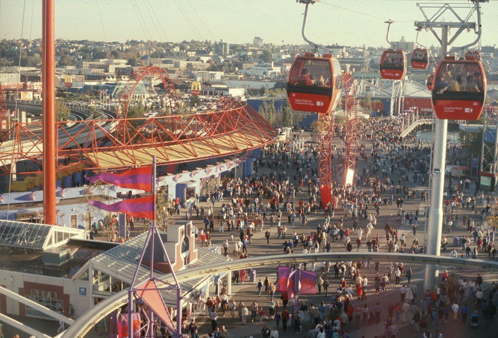
It is May 2026, and as Vancouver celebrates the 40th anniversary of Expo 86, the city is reflecting on how those five months transformed our skyline forever. But for the team at Can-Design, we’re looking at it through a slightly different lens: the graphics.
Expo 86 wasn’t just a world fair; it was the most ambitious Environmental Graphic Design (EGD) project in Canadian history. Before the era of high-speed digital wide-format printers, a team of designers had to manually “skin” 173 acres of industrial wasteland using nothing but color, steel, and massive amounts of physical signage.
Here is a deep dive into the graphic “bones” of Expo 86 and how that history informs the work we do today.
1. The Psychology of the “Colour Zones”
The primary challenge of Expo 86 was its shape: a long, thin 4.5km stretch along False Creek. Without a clear visual system, visitors would have been exhausted and lost. The solution was radical color-coding.
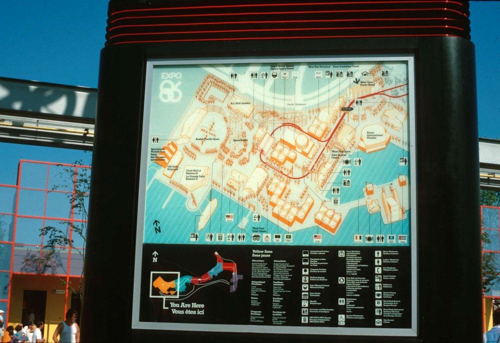
- The Can-Design Take: Today, we call this Wayfinding. In 1986, achieving that level of colour consistency across different materials (paint, plastic, fabric) was a nightmare. Today, our colour-matching technology allows us to ensure that a client’s “Brand Red” looks identical whether it’s printed on a mesh fence wrap, a backlit acrylic sign, or a floor decal.
2. Wayfinding in Motion: The Monorail & SkyTrain
1986 was the year Vancouver truly “moved.” The introduction of the SkyTrain and the on-site Monorail meant that graphics were no longer static; they were being viewed at 50km/h.
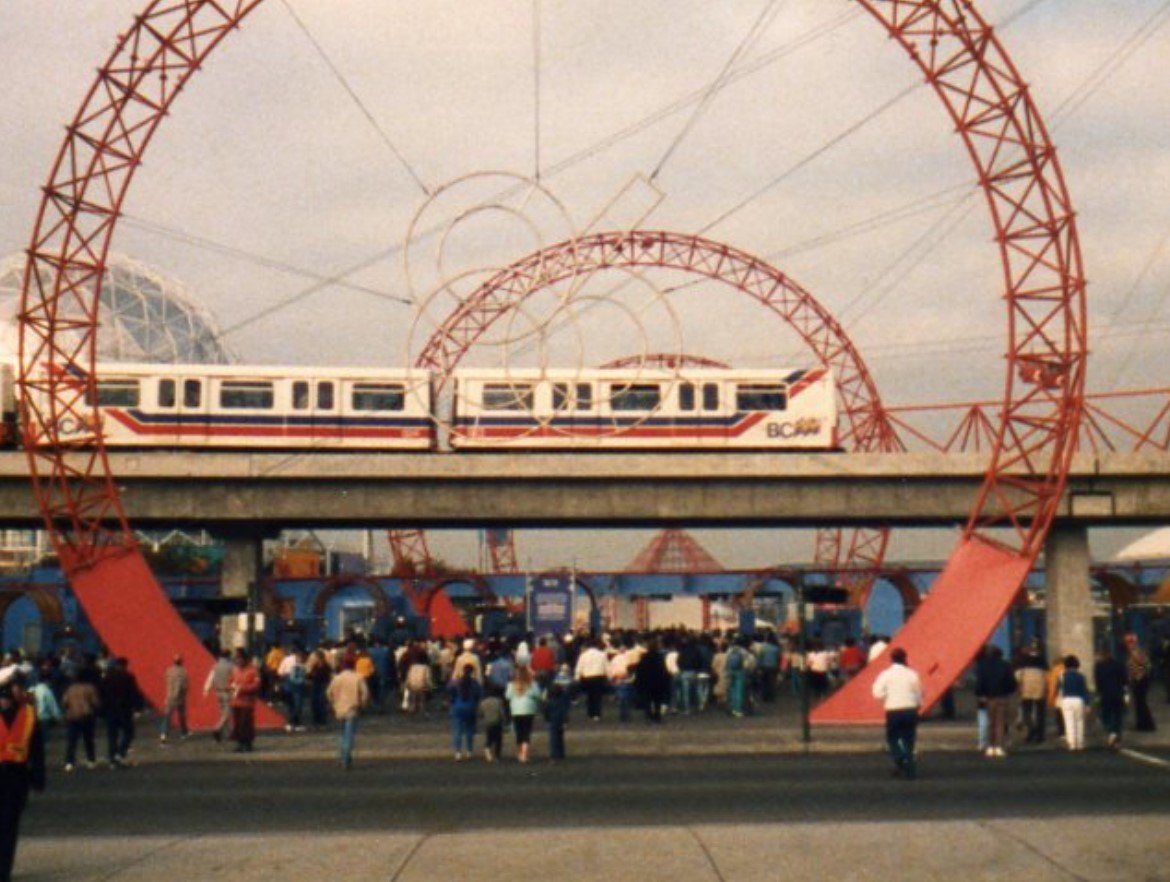
- The Can-Design Take: This was the precursor to the modern Vehicle Wrap. In the 80s, these were often hand-painted or made from early adhesive films with limited lifespans. Now, we use high-performance cast vinyl that can contour to any vehicle shape, lasting years in the Pacific Northwest rain. When we design for motion, we still use the “Expo Rule”: Bold contrast and zero clutter.
3. The “Expo Module”: Design Under Pressure
One of the most fascinating technical aspects of the fair was the “Universal Module.” Most pavilions were built using a standardized triangular space frame. Because the buildings were identical, the graphics had to do 100% of the branding work.
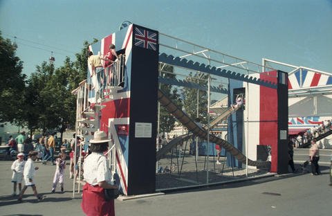
- The Can-Design Take: This is exactly what we do for trade shows and “pop-up” retail. We take a standard space and use large-format tension fabric and wall murals to make it unrecognizable. Expo 86 proved that you don’t need a custom building to tell a brand story—you just need the right graphics.
4. Scaling the Spirit: Canada Place
While False Creek was the heart, Canada Place was the crown. Its “Five Sails” remain the ultimate example of how architecture can act as a giant graphic element.
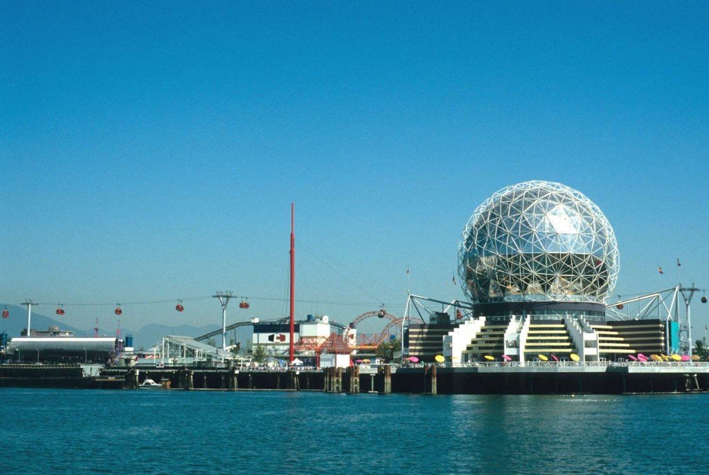
- The Can-Design Take: Scaling graphics to the size of a ship or a pier requires an understanding of wind loads and material tensile strength. We often look back at the original specs for Canada Place as a benchmark for how to handle large-scale outdoor installations in a marine environment.
Why This History Matters to Our Clients
History tells us that people don’t just remember the “stuff” they saw at an event; they remember how it felt to be in that space. The “feeling” of Expo 86 was created by designers who understood that size matters, color communicates, and quality lasts.
At Can-Design, we aren’t just printing files. We are building on 40 years of Vancouver’s visual expertise. When we help a developer wrap a construction site or a business overhaul their office branding, we’re using the same principles of “spectacle and scale” that made 1986 so unforgettable.
Interactive Bonus: “Find the 86”
If you’re walking the False Creek seawall this month, keep an eye out for the original bright yellow “86” benchesone of the last physical graphic remnants of the fair.