


The visual identity of a franchise is the foundation of consumer trust. In a rapidly expanding market, the ability to maintain brand consistency across dozens of locations is what transforms a local business into a provincial staple. At Can-Design, we specialize in engineering the comprehensive visual systems that allow these large-scale rollouts to succeed.
Our work with BC Cannabis and BC Liquor highlights our systematic approach to franchise development, where high-performance fabrication meets strategic environmental storytelling.
The Framework of a Franchise Rollout
Building a visual system for a franchise requires a deep understanding of scalability. Every graphic, panel, and sign must be engineered for repeatability while maintaining the highest standard of quality.
Case Study: BC Cannabis Stores
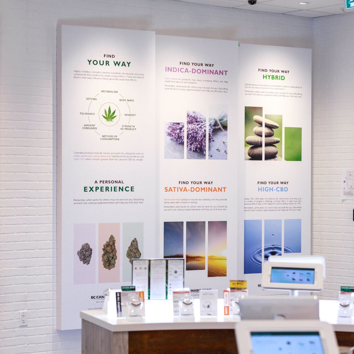
For the BC Cannabis rollout, our objective was to create an educational and inviting environment that remained fully compliant with strict industry regulations. We developed a multi-layered graphics package that turned retail space into a learning center.
- Informational Architectures: We fabricated high-definition environmental graphics that guide customers through complex topics like terpene profiles and plant anatomy. These “Find Your Way” panels use precision digital printing to ensure even the smallest text is crisp and legible.
- Custom Modular Fabrications: To ensure longevity and a premium feel, we utilized custom metal fabrication and panel systems. These allow for a consistent look across different store footprints, adapting the “Look of the Brand” to unique architectural layouts.
- Botanical Feature Walls: Large-scale, high-resolution botanical art walls provide a sophisticated backdrop, moving the retail experience toward a high-end apothecary aesthetic.
Connecting the Social Fabric: BC Liquor
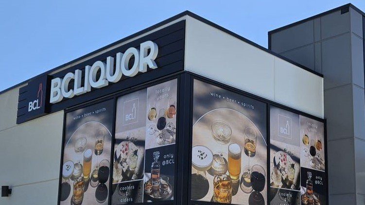
Our expertise in regulated franchises extends to our long-standing work with BC Liquor. Much like the BC Cannabis project, the signage for BC Liquor serves as a neighborhood anchor.
At locations like Wesbrook Village and Cambie, we implemented large-format window wraps and “Coldzone” icons that have become synonymous with reliability. By managing the visual systems for both of these provincial giants, we ensure that the “Visual Map” of British Columbia remains cohesive and professional.

Why Experience in Regulated Industries Matters
Developing signage for franchises like BC Cannabis and BC Liquor requires more than just printing; it requires a partner who understands the nuances of regulated branding and local bylaw requirements.
- Consistency at Scale: We ensure that the brand colors remain identical from one city to the next. Our color management protocols are a critical component of franchise longevity.
- Durability for High-Traffic: Our materials are selected for their ability to withstand the daily interactions of thousands of customers. From architectural signage to floor graphics, we build for the long haul.
- Efficiency in Rollout: Our internal systems are optimized for multi-site installations. We synchronize the fabrication and deployment phases to minimize downtime for the franchise.
Defining the Future of BC Retail
Whether it is a heritage-inspired neon restoration or a modern, data-driven graphics package for a new franchise, the goal is the same: to create a landmark. We are proud to provide the technical backbone for the brands that define our city’s streets.