


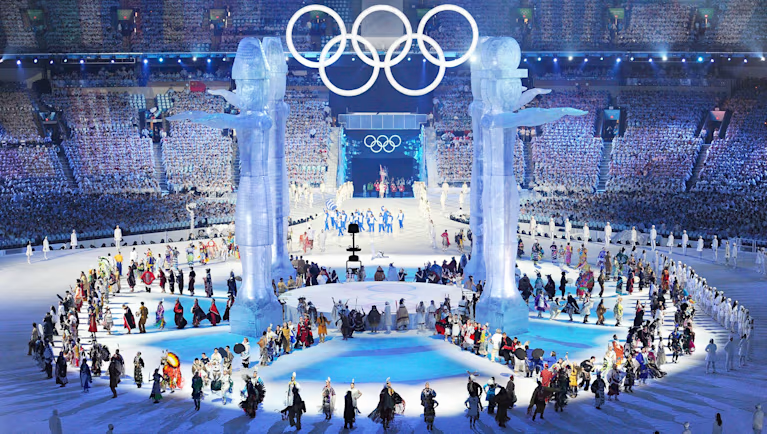
The 2010 Winter Games represent the peak of Vancouver’s modern visual identity. This era introduced the “Look of the Games,” a graphics package that remains the most ambitious environmental branding project in Canadian history. This cohesive visual story transformed the city into a unified global stage.
The following research-backed breakdown explains how Vancouver established its world-class brand.
1. The Visionary: Leo Obstbaum

Leo Obstbaum, the Design Director for the Vancouver Organizing Committee (VANOC), led the entire visual identity. He pioneered a “living” graphic system that adapted across the city’s landscape.
Obstbaum passed away in late 2009, leaving the 2010 branding as his final masterpiece. His work demonstrated that signage functions as a cultural narrative.
- Research Detail: Learn about the transition to dynamic branding systems via the Association of Registered Graphic Designers (RGD).
2. The Three-Layer Design Philosophy
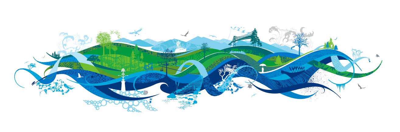
The 2010 graphics package provided immense versatility through a sophisticated, three-layered system. This approach allowed for seamless scaling from small bus passes to massive large-format graphics.
- Layer 1 (The Base): Sweeping shapes in the “Sea to Sky” palette represented the energy of the Pacific Northwest.
- Layer 2 (The Texture): Ink-drawn illustrations featured coastal forests and urban grids. Local Aboriginal artist Xwalacktun contributed key textures to this layer.
- Layer 3 (The Whimsy): Detailed silhouettes of Canadian life—such as a fire hydrant with an umbrella—offered moments of discovery for those viewing the graphics up close.
This system ensured that the branding offered both a massive impact from a distance and intricate details upon closer inspection.
- Technical details on these layers are documented at designKULTUR.
3. The “Sea to Sky” Palette
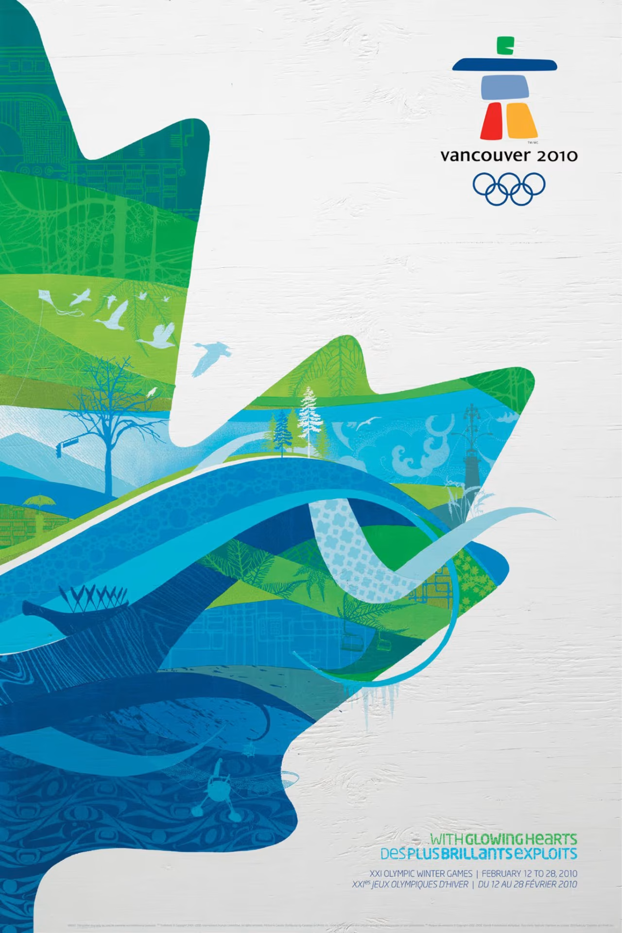
The design team selected colors that resonated with Vancouver’s specific geography:
- Wave (Bright Blue)
- Fern (Lime Green)
- Glass (Teal)
These colors mirrored the transition from the Pacific Ocean (Sea) to the mountain peaks of Whistler (Sky). This palette grounded the international event in a local context, making the branding an extension of the natural environment.
- Official color design details are available at Olympics.com.
4. Environmental Storytelling: Building Wraps
Vancouver used environmental graphics to turn architecture into a storytelling medium:
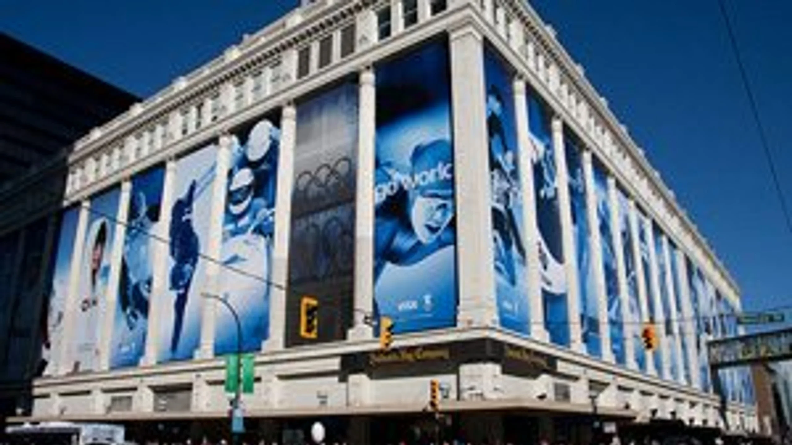
- The Hudson’s Bay (Georgia & Granville): Massive 5m x 16m banners featuring Olympic athletes wrapped this landmark. This transformation turned a retail space into a prominent city monument.
- The Fairmont Pacific Rim: A 22-story poem by British artist Liam Gillick—”lying on top of a building…”—became a permanent visual fixture of the Coal Harbour skyline.
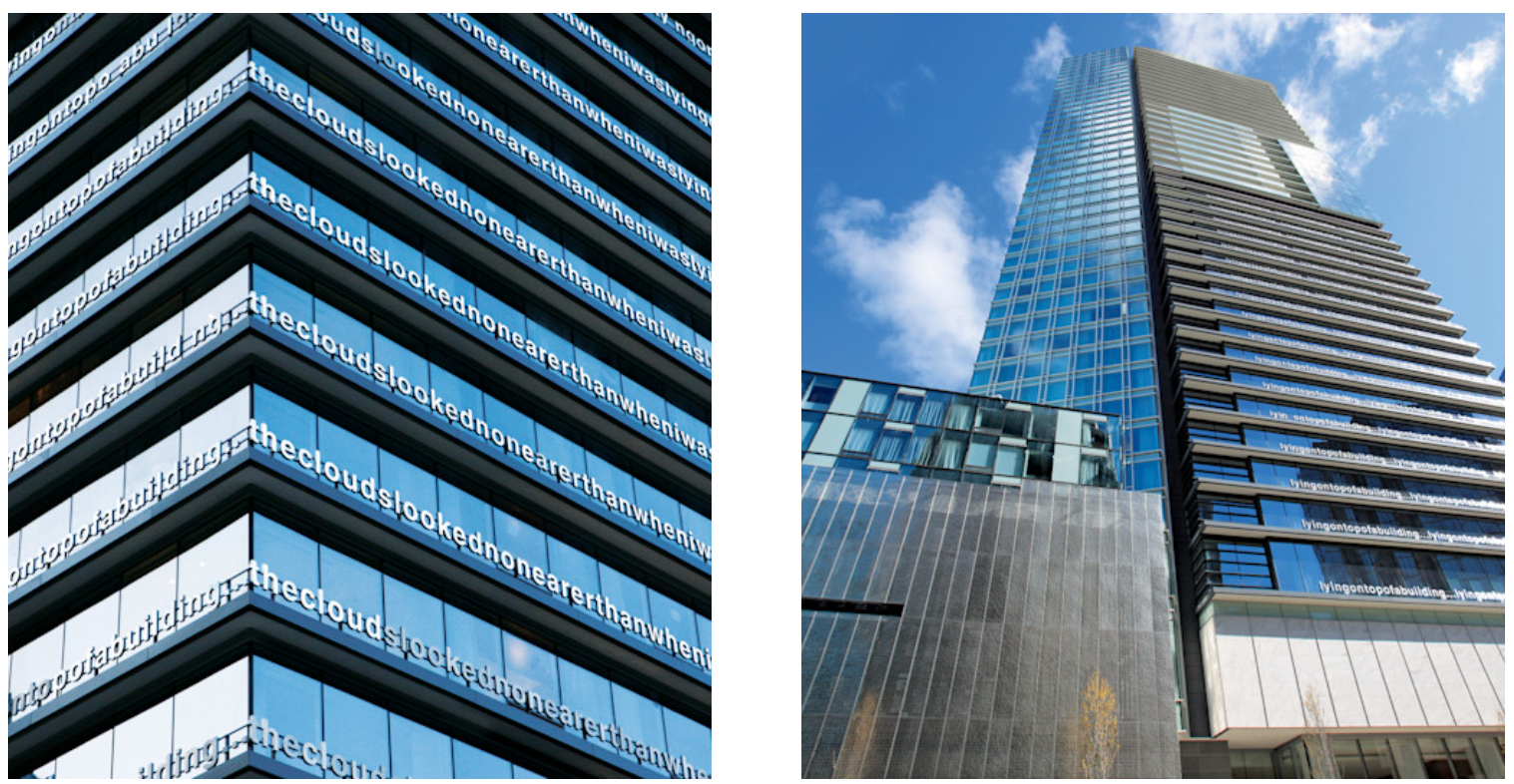
These projects highlight how architecture serves as a primary canvas when paired with expert fabrication partners.
- Details on the HBC transformation are found at Global News.
5. The Logo: Ilanaaq the Inukshuk
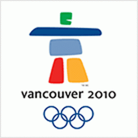
The official emblem, Ilanaaq (Inuktitut for “friend”), was designed by Elena Rivera MacGregor and Gonzalo Alatorre. The colors in the Inukshuk carry specific meanings:
- Green and Blue: Coastal forests and mountain ranges.
- Red: Canada’s national identity.
- Yellow: Sunrises over the local mountain peaks.
Ilanaaq served as a symbol of hospitality and human connection, presenting Vancouver as a welcoming global host.
- The original logo unveiling is archived at CBC Sports.
Bringing the Gold Standard to Your Brand
The 2010 Games established a blueprint for integrating signage with the urban environment. At Can-Design, we apply these principles of scale, color, and storytelling to help our clients build the next generation of landmarks.
We have built a graphic design package that contributed directly to the Richmond Olympic Oval. A staple landmark birthed from the Vancouver Olympics.
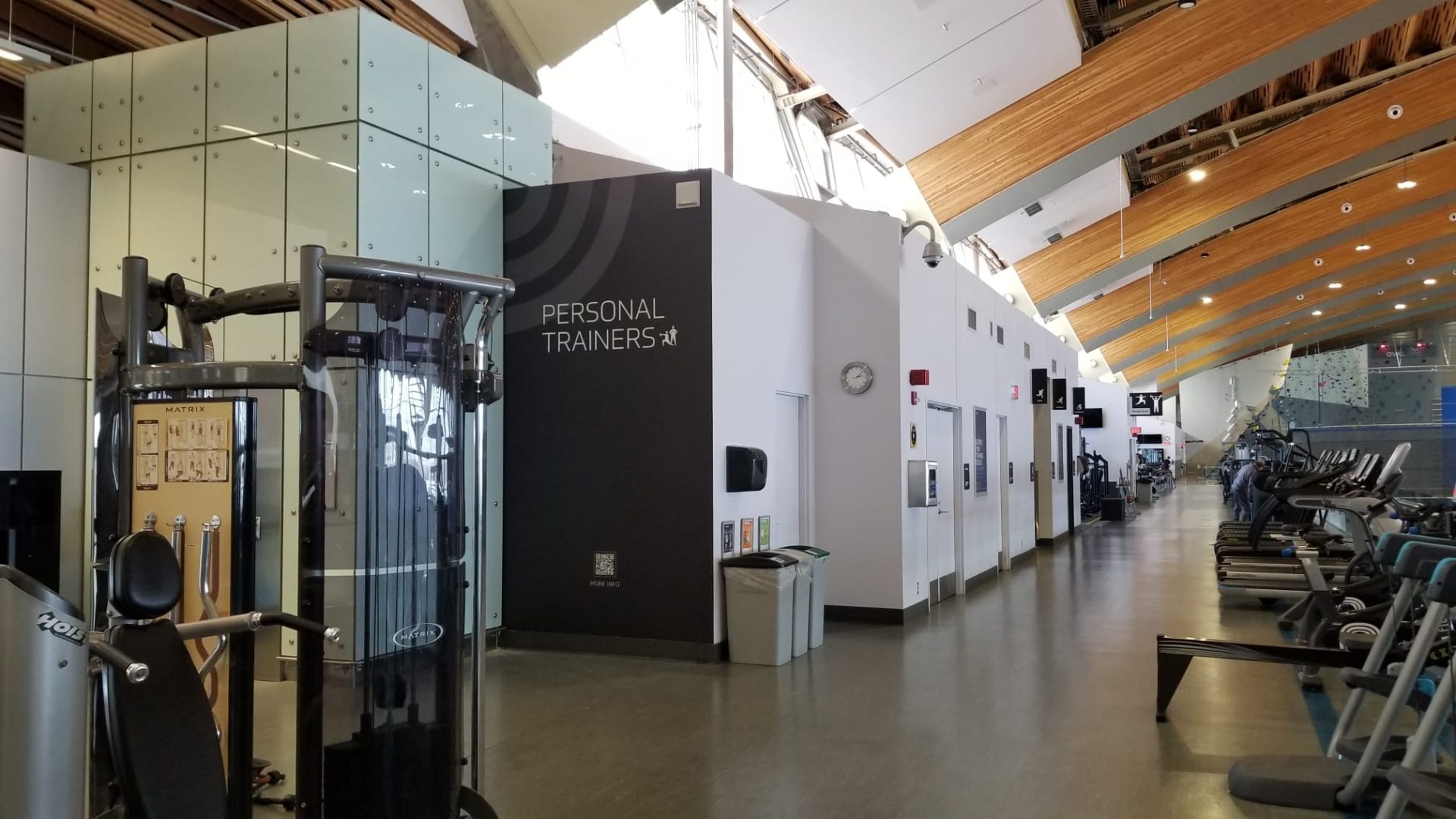
Whether you are planning a storefront wrap or a custom-fabricated icon, we focus on creating a lasting visual legacy.
Ready to define your brand’s place in the city? Contact our fabrication experts today.