


When people walk into a space, the first thing they feel isn’t your logo
It’s whether they know where to go.
That moment of clarity (or confusion) is where wayfinding signage makes all the difference.
At Can-Design, we’ve seen how clear wayfinding can transform an environment. It’s not just signs and arrows. It’s how a space communicates.
What Wayfinding Really Does
Wayfinding signage quietly shapes how people experience your space. It helps visitors feel grounded and confident instead of lost or uncertain.
Whether it’s a student finding their classroom, a client arriving for a meeting, or a delivery driver locating your loading bay, good wayfinding removes friction.
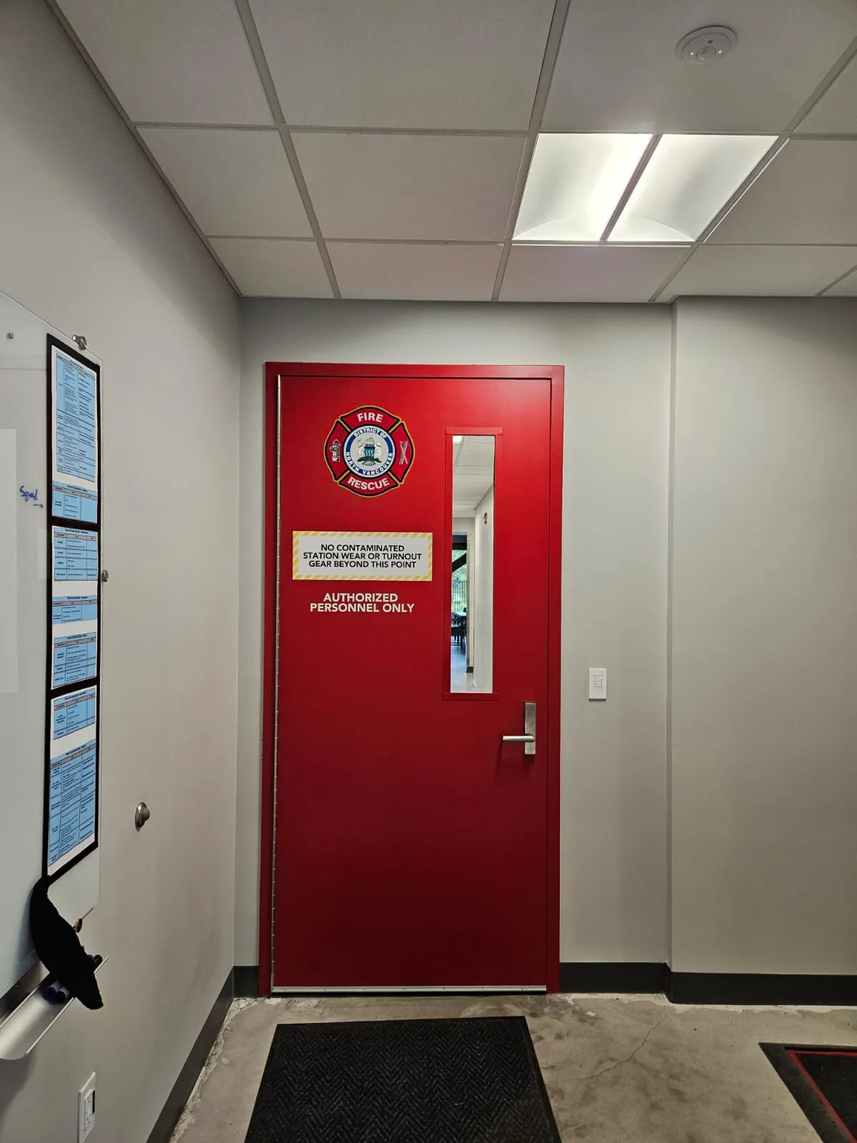
It makes the experience feel seamless, professional, and intentional.
In short it’s the part of design people don’t always notice when it’s done right.
Lessons From Our Own Space
In our Burnaby warehouse, logistics operators make daily deliveries.
Without clear signage directing them to the correct garage and delivery entrance, confusion would slow down every shipment.
Simple but consistent wayfinding
That same principle applies to any business. Whether it’s staff flow, customer navigation, or visitor access, signage is part of your infrastructure.

Wayfinding in Action: From Campuses to Corporate
We’ve applied this thinking across Metro Vancouver projects where navigation meets brand identity:
- Kwantlen Polytechnic University (KPU). Experiential signage and wayfinding for the Traditional Chinese Medicine teaching clinic. Calming visual language, clear room IDs, and culturally sensitive cues to guide patients and students through treatment and teaching spaces.
- University of British Columbia (UBC). Campus wayfinding principles applied to multi-building navigation. Clear hierarchy, consistent typography, and color zoning to help visitors move from gateway entries to departments, amenities, and transit connections.
- Signature Aspac Presentation Centre. Visitor path design from entry to sales gallery and model suites. Discreet directional cues, zone IDs, and material-matched placards that support the sales flow without distracting from the architecture.
Each of these projects had a different challenge, but the outcome was the same — spaces that feel clear, consistent, and on-brand.

The Types of Wayfinding Every Space Needs
A strong wayfinding system usually includes:
- Identification signs (lobbies, rooms, departments)
- Directional signs (arrows and routes)
- Informational signs (policies, hours, deliveries)
- Regulatory and accessibility signs (braille, tactile, evacuation maps)
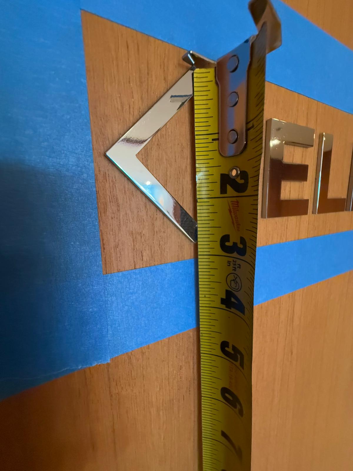
Together, these elements create a visual rhythm that guides people effortlessly. The design may vary — from architectural aluminum to printed vinyl — but the goal stays the same: clarity.
Why It’s a Smart Investment
Investing in cohesive wayfinding pays off far beyond aesthetics.
It saves staff time, reduces confusion, and strengthens your brand’s professionalism.
The biggest ROI often comes from system-level design — a coordinated program that can scale across multiple locations or buildings.
That’s where we combine consultation, design, and fabrication to ensure every sign looks intentional and works together as part of a bigger picture.
Our Take at Can-Design
We see wayfinding as the bridge between design and experience.
Every sign, font, and material choice contributes to how people feel in your space.
Our process begins with understanding the journey — where people enter, pause, and make decisions — and ends with a signage system that fits your brand and lasts through years of daily use.
Because clear signage doesn’t just guide people.
It gives them confidence that they’re in the right place.