


When it comes to attracting customers, your signage is often the first chance you have to make a great impression. Understanding the psychology of signage can help you create effective signs. Whether it’s a storefront sign, an interior wayfinding sign, a reception sign, or another type of signage, strategic design can dramatically influence how customers or clients feel about your business, including whether they choose to step inside or walk away.
First Impressions Matter: Harness the Psychology of Signage
When someone comes across a sign, they make a judgment within seconds. In a fleeting moment, the colour, shape, and overall cohesiveness of the design convey a message. In a split second, people decide whether to trust and enter a business or simply walk on by.
An attractive, thoughtfully designed sign communicates professionalism, effort, and credibility before a single word is read. When colours, fonts, and layout work together, they inspire confidence and create a positive impression that encourages people to engage with your brand.
The Psychology of Signs: What to Consider for Designing Signs
At Can-Design, our innovative team understands that creating effective signage requires a thoughtful blend of psychology, aesthetics, and strategic communication. Here’s how you can leverage design psychology to create signage that resonates with your target audience:
Choose Colours That Fit Your Brand and Work in Context
When someone passes your sign, colour is one of the first things that stands out. Colours should complement your brand identity and logo for overall visual harmony, but also work well in the setting where they are installed. This means considering the lighting, surroundings, and distance from viewers.
For a must-see sign that you would like to capture attention, consider bold, high-contrast colour combinations. On the other hand, softer colours can work nicely when the goal is to convey sophistication. For example, a spa may use colours associated with calm, such as blue, while sale or safety signage can benefit from attention-grabbing colours like red and yellow.

Choose Shapes that Convey the Emotional Tone You Want to Project
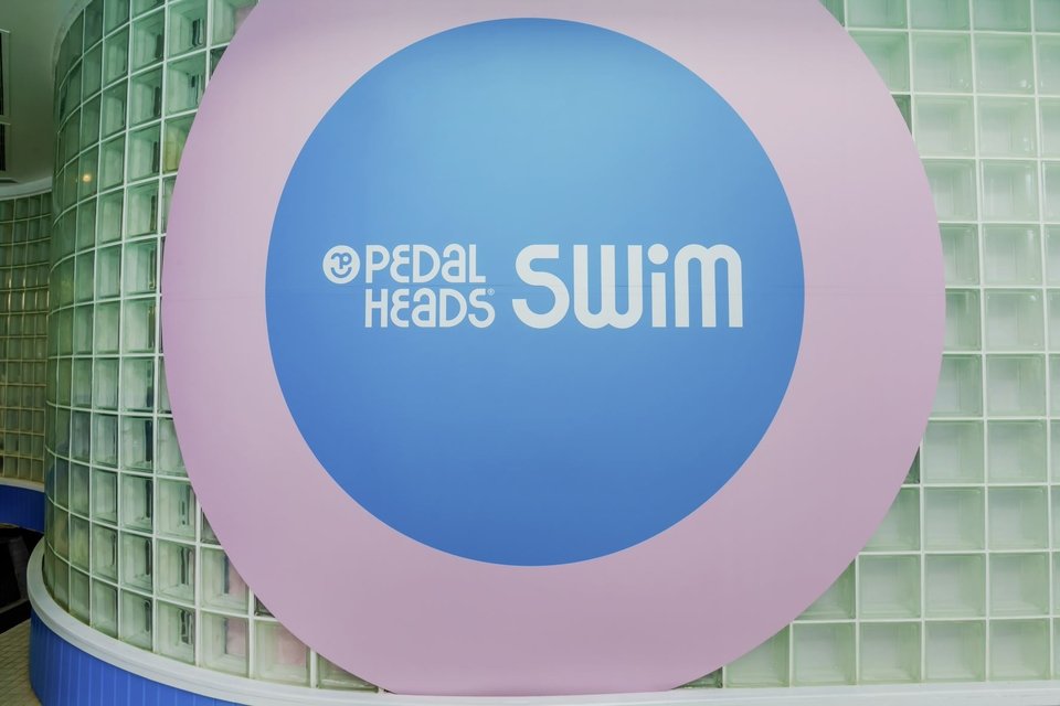
Different shapes elicit different emotional responses in viewers. Squares convey strength and stability, circles represent continuity and community, and sharp angles, such as triangles and diamonds, offer a more innovative or urgent vibe. This might sound strange because it’s not something you think about, but subconsciously, shape matters!
Test Out the Readability of Your Text in Different Contexts
Even the most beautifully styled sign is destined to fail if it can’t be easily read. To process information quickly, our eyes need clear fonts and proper hierarchy. Decorative scripts and cursive are not a good choice for most signs. Sans-serif fonts are considered the best option for easily readable designs.
Ensure adequate spacing of letters and words and an appropriate size for the most likely viewing distance. Try reading your design from various distances and in different lights (day and night). If you have trouble reading your sign, then others will too! If using illuminated signs, make sure the message is well-lit and visible.
Use Size and Contrast to Prioritize Your Message
When we scan something, visual hierarchy guides the eyes. You can use this to ensure that viewers of your sign get the central idea you want to convey without having to think to figure it out. The most important information should be larger and bolder, while secondary details (such as taglines or hours of operation) can be smaller and positioned less prominently. Avoid cluttering the sign and let the main idea show clearly!

Consistency is Key
For your signage to be as effective as possible, each sign should be more than a standalone piece. All your signage should work together as part of a cohesive visual system that projects your brand identity and provides your customers or clients with the information they need. Create consistency between your signage, digital presence, packaging, and interiors by using the same colour palette, typography, and logo placement throughout for brand recognition.
Design Signs That Everyone Can Understand Easily
Think about inclusivity by considering the ages and abilities of the people you are hoping to guide with your signs. High contrast colours, clear typography, and tactile elements such as Braille lettering help users with visual impairments move through spaces.
Choose Sign Placement Wisely
Where a sign is displayed within its environment influences how it’s seen. When installing a sign, be sure to think about eye level, where sight lines will be, and the flow of movement through the space. If you are positioning a sign meant to be seen outdoors from a busy street, the positioning will need to be different than if you are using wayfinding signage indoors to guide people.

We Understand the Psychology of Signage and Can Help
With the right design, signs are not just seen, they are understood, felt, and remembered. At Can-Design, we’ve worked with countless businesses to enhance their environments with attractive, visible, and meaningful signage. Contact us today to learn more about how we can help you create custom signs that attract the attention you want.