


Trade shows and conferences are some of the best opportunities to connect with future clients face-to-face. But while companies spend thousands on booth space, travel, and staff, the design of the booth itself often determines whether you walk away with new leads — or none at all.
Your booth isn’t just a display. It’s a marketing asset that should capture attention, spark conversations, and leave a lasting impression both in-person and online. Avoiding the most common trade show booth mistakes will make sure your investment pays off long after the event ends.
For businesses across Metro Vancouver — from Burnaby and Surrey to Richmond and downtown Vancouver — trade shows and conferences are a major opportunity to showcase your brand. A locally designed booth ensures your graphics not only attract attention but also align with regional bylaw requirements and event venue guidelines.

Why Booth Design Matters More Than Ever
Trade shows aren’t just crowded, they’re competitive. You’re fighting for attention in a hall filled with hundreds of other brands. And today, your booth does double duty:
- 81% of trade show attendees have buying power (Statista), meaning the majority of visitors could be legitimate leads.
- Booths are no longer only physical spaces. They’re built for the feed. Attendees snap photos and post on LinkedIn, Instagram, and event apps, multiplying your reach.
- First impressions aren’t casual. In seconds, prospects decide whether to engage with you or keep walking.
With budgets for booth space and staffing climbing, the last thing you want is a preventable mistake undermining ROI.
The Most Common Trade Show Booth Mistakes
1. Overcomplicating Your Graphics
When companies try to cram too much text onto booth walls, it overwhelms visitors. Long taglines, multiple offers, or walls of bullet points mean people walk by without reading a word. Trade show halls are busy — nobody has time to decode your message.
✅ Fix: Stick to simple, bold, benefit-driven messaging. Think of it like a billboard: a passerby should understand who you are and why they should stop within three seconds. Use one clear headline, your logo, and one call-to-action. Save the details for your team to explain once visitors engage.
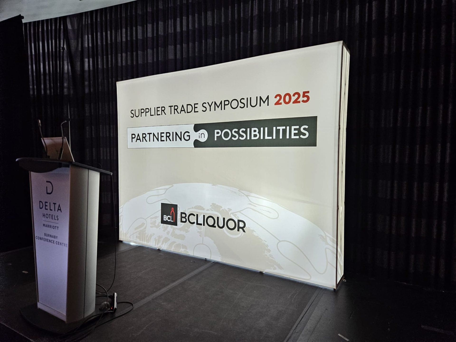
2. Ignoring Visibility and Height
If your logo is hidden behind clutter, your booth signage sits too low, or your design doesn’t stand out from a distance, attendees may never even notice you. Visibility is especially critical in crowded halls with rows of exhibitors.
✅ Fix: Prioritize verticality. Use hanging signs, tall backdrops, and clean branding that’s visible from across the aisle. Place your logo and core message at eye level and above head height. The goal is to catch attention before people are directly in front of your space.
3. Poor Lighting Choices
Even a beautifully designed booth falls flat under bad lighting. Too dim makes it look uninviting; too harsh or uneven makes it look cheap. Many businesses rely only on overhead venue lights, which rarely flatter graphics or products.
✅ Fix: Treat lighting as a design element. Incorporate backlit graphics, spotlights for key products, and balanced LED fixtures to create a polished look. Lighting sets the tone for your brand — warm and welcoming, or cold and overlooked. Investing here pays off in perceived quality.
4. Forgetting the Visitor Journey
A booth without flow feels chaotic. Blocked entrances, cluttered counters, or confusing layouts discourage people from stepping in. If it’s not clear how to enter or where to go, attendees will keep walking.
✅ Fix: Map out a simple visitor journey: approach → entry → engagement → exit. Leave clear pathways, avoid placing staff as a physical barrier, and guide people toward your key displays or demo area. Think of your booth as a retail store — design it so the experience feels intuitive.
5. No Interactive or Experiential Element
A static booth is easy to ignore. Rows of brochures and a standing banner don’t stand out in a hall filled with competing visuals. Without something to engage visitors, you risk blending into the background.
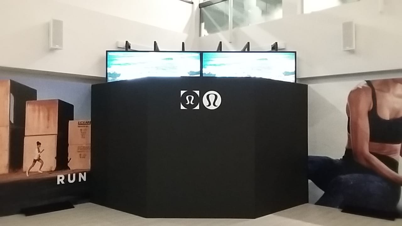
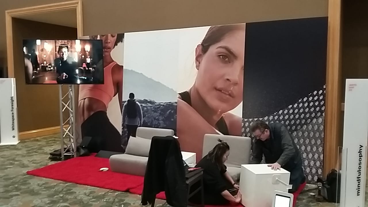
✅ Fix: Add an interactive or experiential element. This could be a product demo, touchscreen, sampling station, or even an Instagrammable backdrop graphic. When attendees can do something instead of just look, they stay longer — and share their experience online, extending your reach.
6. Skipping Pre-Show Marketing
Many exhibitors assume foot traffic alone will fill their booth. But with so many distractions at a show, you can’t count on attendees to stumble across you. Without pre-show promotion, you risk low engagement no matter how good your booth looks.
✅ Fix: Market your booth number and offering before the event. Share it on LinkedIn, send an email campaign, and use event hashtags. Encourage people to book meetings in advance. Pre-show buzz ensures you’re on attendees’ agendas before they walk in the door.
How to Avoid These Mistakes (Best Practices)
- Invest in clear, bold booth graphics that highlight your unique value.
- Use consistent brand colours across your signage (retail graphics case study with BC Liquor).
- Plan your booth layout for flow, visibility, and accessibility.
- Incorporate interactive signage or experiential elements to stand out.
- Train your team so they’re welcoming and knowledgeable — people remember the staff as much as the graphics.
- For a step-by-step breakdown of how to do it right, check out our guide on How to Create an Excellent Trade Show Display Booth.
Bonus: Conference Booth Mistakes in Vancouver (Same Rules Apply)
While trade shows usually involve larger budgets and booths, the same mistakes appear at conferences, expos, and seminars in Vancouver. Smaller booths are even more vulnerable to clutter, poor lighting, and lack of engagement.
The rules don’t change: whether you’re setting up at a trade show at the Vancouver Convention Centre, a corporate conference in Burnaby, or a community expo in Surrey, your booth needs to be visible, engaging, and easy to navigate.
Final Takeaway
A booth isn’t just a cost — it’s a lead generation tool. Avoiding common mistakes ensures your investment brings measurable ROI in the form of stronger conversations, better leads, and lasting impressions.
If you’re planning a trade show or conference booth in Metro Vancouver, Can-Design can help with booth graphics, signage, and experiential design that stand out and deliver results.
FAQ: Trade Show Booths & Lead Gen
1) What is the biggest trade show booth mistake most teams make?
Overloading graphics with text. In a busy hall, no one reads paragraphs. Use one clear headline, a benefit-driven subline, and a single CTA visible from the aisle. Save details for conversations and handouts.
2) How far in advance should I plan my booth graphics and layout?
Aim for 8–10 weeks out. That timeline covers concepting, approvals, production, and contingency for reprints. If you need lighting, flooring, or a hanging sign, lock those in even earlier with the venue.
3) What’s the easiest way to make my booth more engaging without a rebuild?
Add an interactive hook: a bite-size demo, touch display, or a branded, Instagrammable backdrop graphic. Pair it with pre-show promotion (booth #, time-boxed demos) to drive intentional foot traffic.